After more than two decades, the City of Prague has taken a significant step — the modernization of its visual identity. This move not only responds to current demands for effective visual communication but also introduces innovative tools for managing it. Key updates include a new typeface, an expanded color palette, a library of illustrations, and digital optimization.
Evolution, Not Revolution
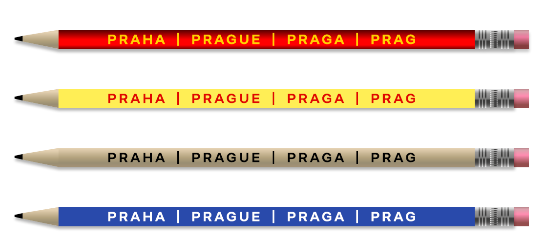
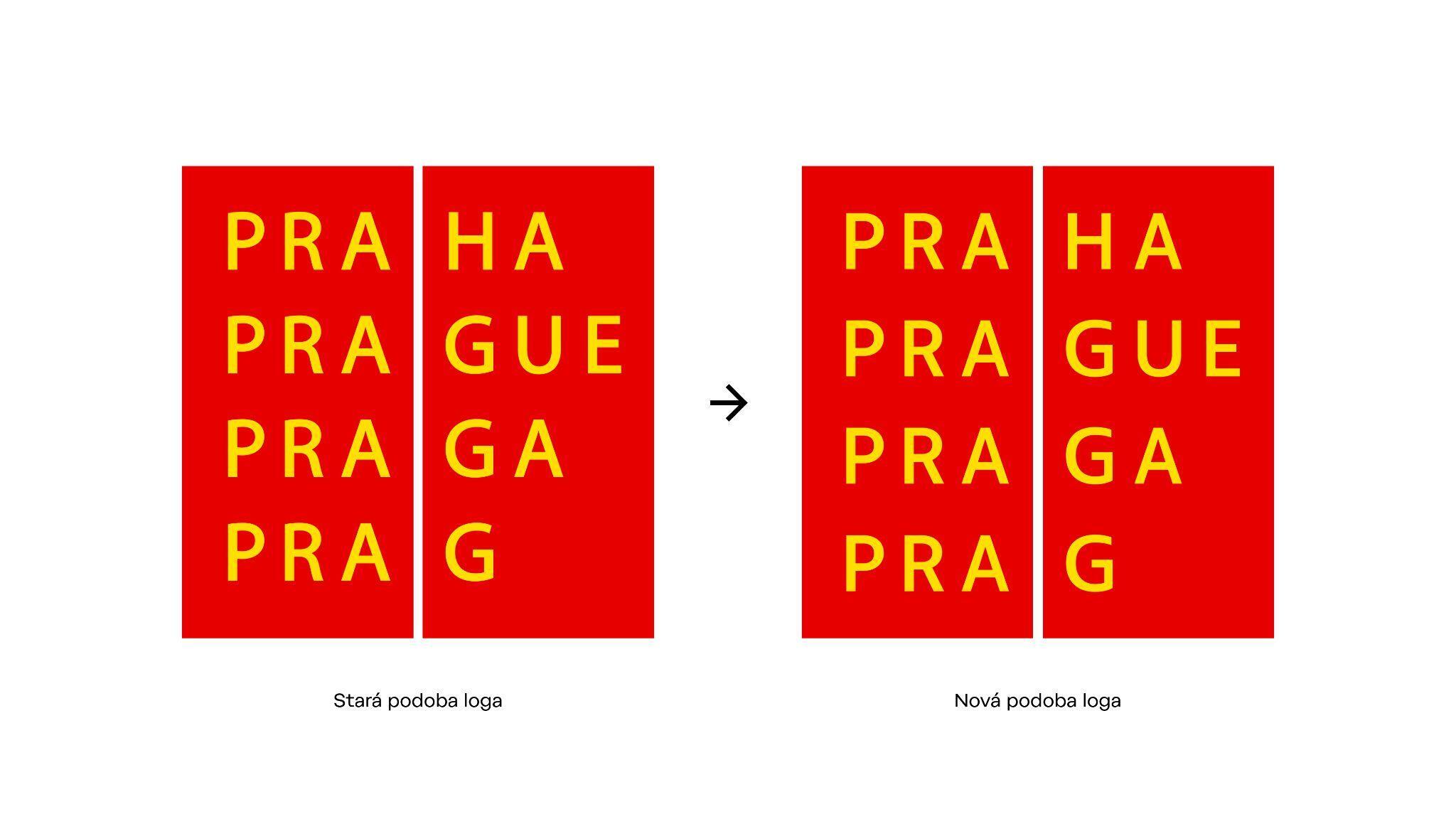
Prague has chosen an evolutionary approach: its iconic red logo with yellow text remains, now complemented by a modern graphic style tailored for digital use.
“Our logo is strong and timeless, which is why we wanted to keep it,” explains Jana Berková, Head of Media and Marketing at the Prague City Hall. “We’ve enriched the design manual with new elements that better suit today’s needs and the digital environment.”
What’s Changing?
The new visual style, designed by Studio Najbrt, brings a number of key changes:
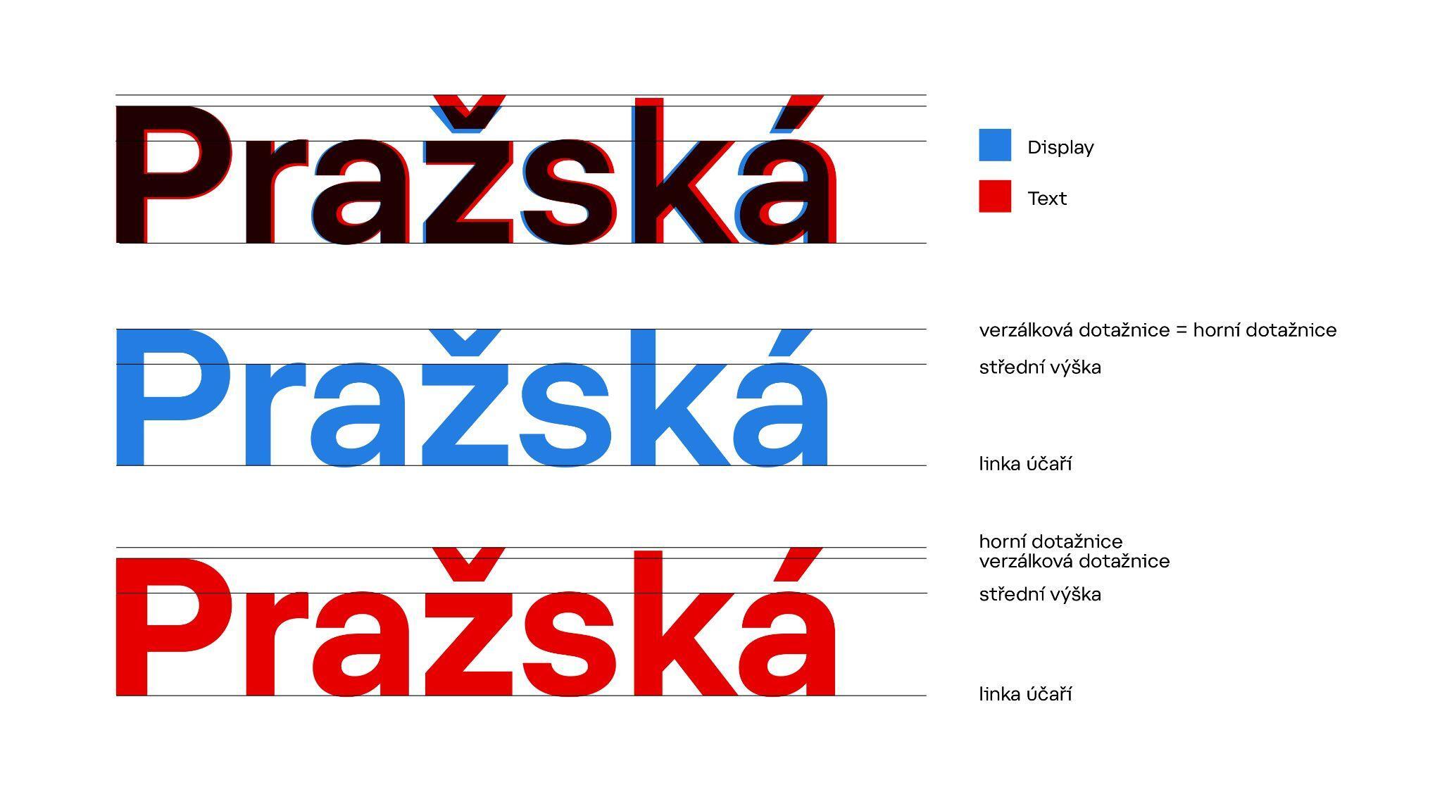
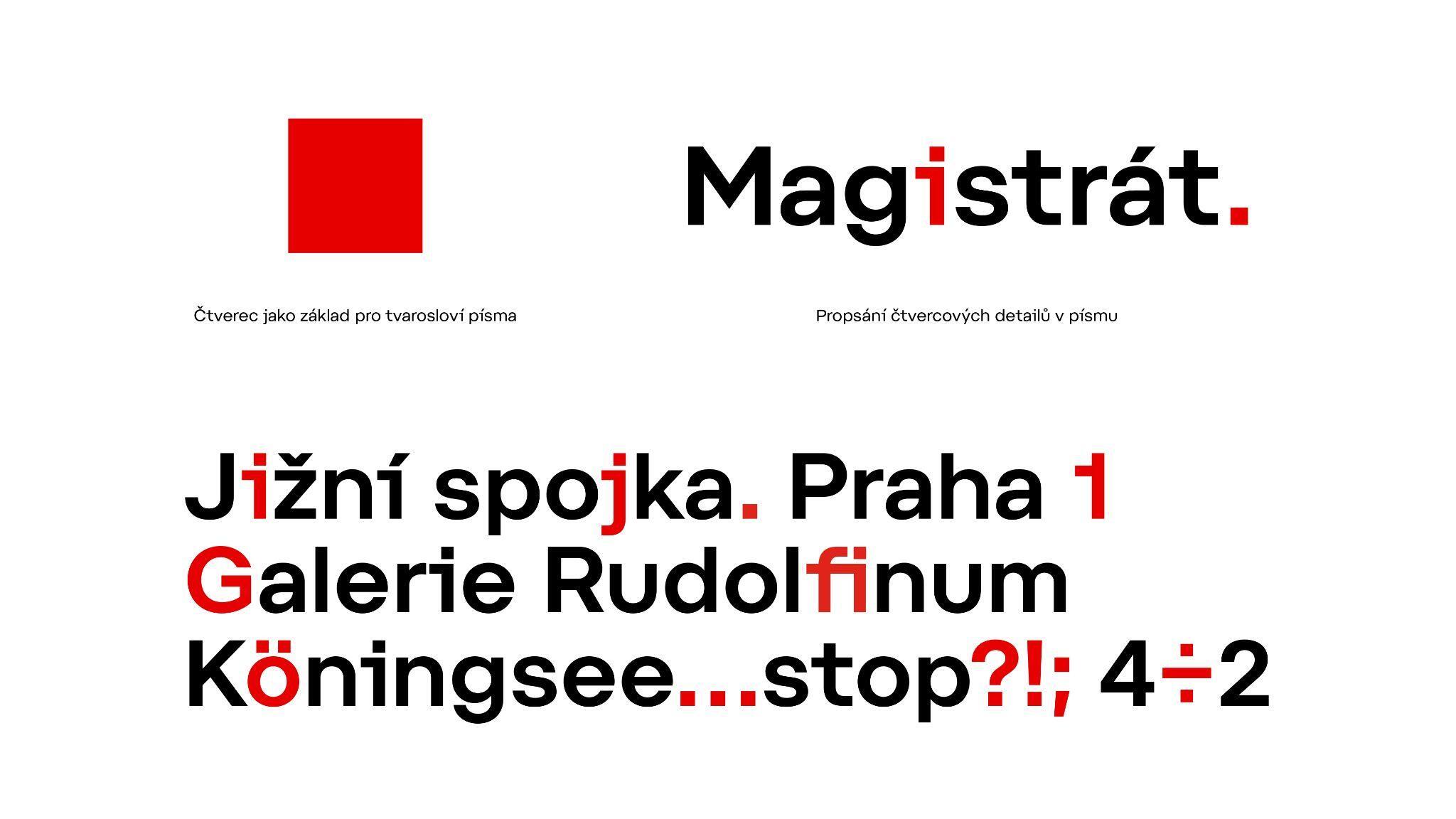
- Praha Typeface: Designed by typographer Tomáš Brousil, it replaces the previously used Myriad Pro. It comes in five weights and supports a wide range of languages.
- Pictograms and Illustrations: A newly designed set of pictograms visually matches the Praha typeface.
- Color Palette: Alongside the traditional red and yellow, a new range of colors has been added, including metallic tones for ceremonial occasions.
- New Templates for social media, presentations, and email communication.
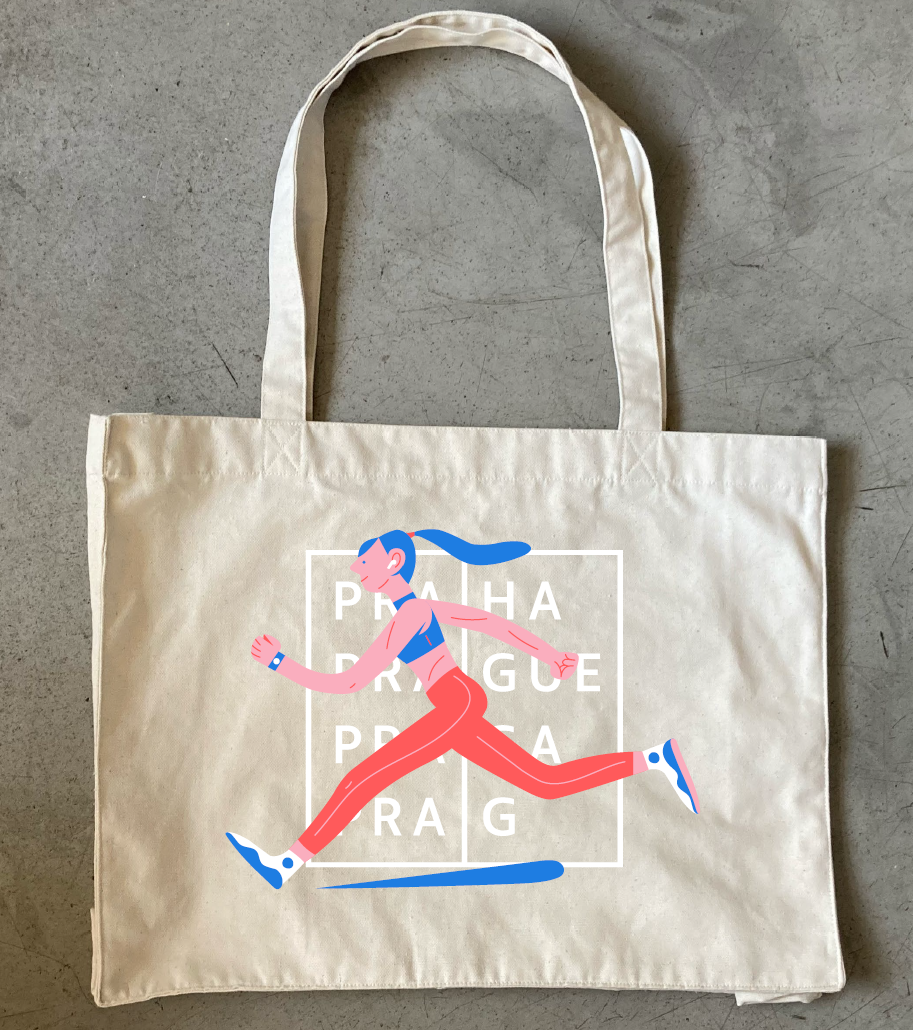
- Merchandise: The new visual style will also appear on promotional items like mugs, tote bags, and socks.
- Layout: A newly defined design system.
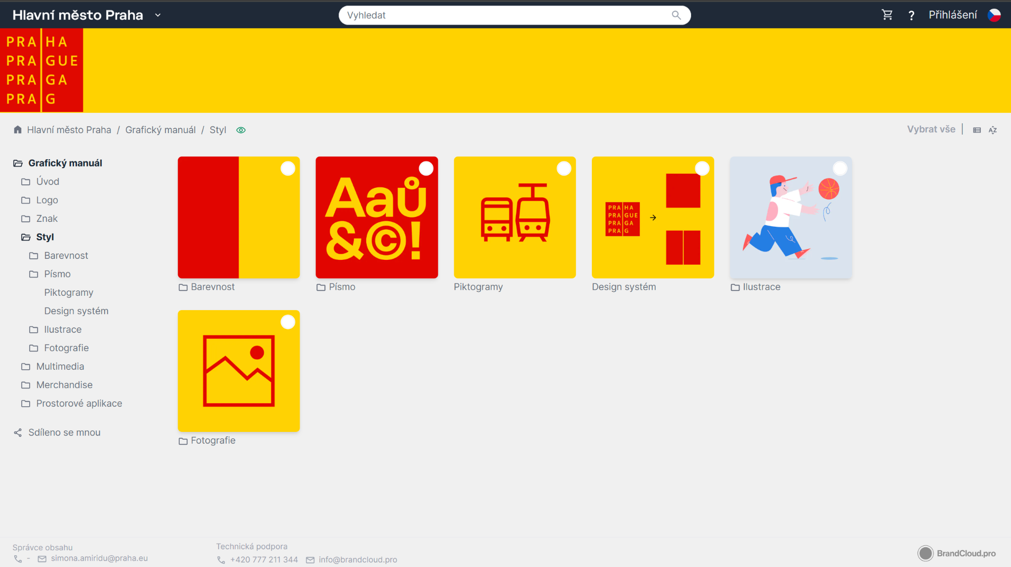
BrandCloud — The Key to Effective Management
A crucial tool in implementing the new visual style is the BrandCloud platform. Since 2017, it has served as Prague’s central repository for all graphic elements, templates, and manuals. Employees and city partners can easily access and consistently use the most current materials.
“When working with an institution as large as the City of Prague, using a storage platform like BrandCloud is essential for systematically managing and implementing a unified visual style.”
— Jakub Spurný, Graphic Designer at Studio Najbrt
How Was BrandCloud Implemented?
- Preparation Phase: A private section was created on praha.brandcloud.pro for uploading and approving new graphic elements.
- Presentations and Training: Once approved, the new manual was presented to city department leads, and training on how to use the platform was provided.
- Final Updates: In the last months of 2024, final updates and additions of illustrations and pictograms took place.
- Official Launch: On January 1, 2025, the public section of BrandCloud was switched to the updated style.
Benefits of the Visual Identity Modernization
- Consistency: All Prague materials are now visually unified, reinforcing the city’s identity.
- Easy Access and Sharing: Staff and partners have instant access to up-to-date visual assets.
- Efficient Management: A centralized repository simplifies updates and distribution.
- Sustainability: Gradual implementation minimizes material waste.
- Security: The spread of visual assets remains under Prague’s control.
“Thanks to its advantages, BrandCloud is an invaluable tool for managing and sharing the city’s visual style, contributing to a unified and professional public image.”
— Jana Berková, Head of Media and Marketing, Prague City Hall
Modernizing Prague’s visual identity and managing it through BrandCloud is an investment in the city’s future. It helps build a strong, modern identity that resonates with residents, visitors, and investors alike — making Prague an even more attractive place to live, work, and visit.

BrandCloud Use in Prague Over the Past 12 Months:
- 57 city districts
- 200+ contributory organizations
- 10,000+ visitors to the Public section
- 85,000+ page views